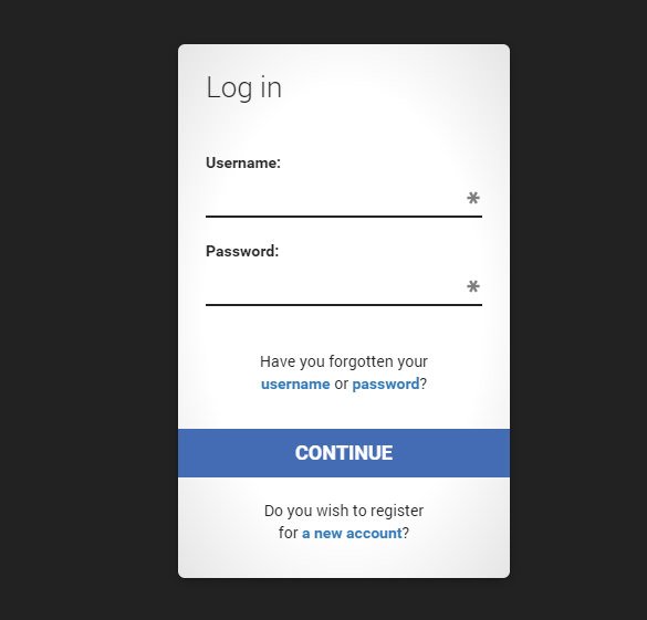
We will style it using CSS3 and an icon font. The idea behind this demo is to show the user the login form and provide a link to “switch” to the registration form.
Note that this is for demo purpose only, it will only work in browser supporting the:target pseudo class, and you should not use this code on a live website without providing solid fallback.
In the following, we will be going through Demo 1.
The HTML
In the HTML, we will put both forms, hiding the second one with CSS. Here is the code, I’ll explain some of the interesting parts later.
We’ve added some HTML5 goodness here and used some of the new inputs. The input type=password
automatically hides what the user is typing and replaces it with dots (depending on browser). The input type=email
enables the browser to check if what the user entered has the format of a valid email address. We’ve also used the require=required
attribute; browsers that support this attribute will not let the user submit the form until this field is filled, no JavaScript required.
The autocomplete=on
attribute will prefill values based on earlier user input. We also used some nice placeholders for the inputs that will show some guiding value when the input is not filled.
Now the two tricky parts. You might have noticed the two links at the top of the form. This is a little trick that will make our form behave nicely when playing with anchors, so that it won’t “jump” on long pages when we click on the switching link and trigger the:target pseudo-class.
The second little trick is related to the use of the icon font. We will be using a data-attribute to display the icons. By setting data-icon=”icon_character” with the according character in the HTML we will just need one CSS attribute selector to style all the icons. Read more about this technique on 24 Ways: Displaying Icons with Fonts and Data- Attributes .
The CSS
For the clearness of the code in this tutorial, I will omit all the vendor prefixes, but you will, of course, find them in the files. Once again, I’m using some pretty advanced CSS3 tricks that might not work in all browsers. Let’s get started.
Styling both forms using CSS3
First, let’s give our two forms some general styling for the container.
#subscribe, #login{ position: absolute; top: 0px; width: 88%; padding: 18px 6% 60px 6%; margin: 0 0 35px 0; background: rgb(247, 247, 247); border: 1px solid rgba(147, 184, 189,0.8); box-shadow: 0pt 2px 5px rgba(105, 108, 109, 0.7), 0px 0px 8px 5px rgba(208, 223, 226, 0.4) inset; border-radius: 5px; } #login{ z-index: 22; }
We’ve added a nice box shadow that’s made of two shadows: an inset one to create the inner blue glow, and an outside shadow. We’ll explain the z-index in a bit.
In the following we will style the header with some background clipping:
/**** general text styling ****/ #wrapper h1{ font-size: 48px; color: rgb(6, 106, 117); padding: 2px 0 10px 0; font-family: "FranchiseRegular","Arial Narrow",Arial,sans-serif; font-weight: bold; text-align: center; padding-bottom: 30px; } /** For the moment only webkit supports the background-clip:text; */ #wrapper h1{ background: -webkit-repeating-linear-gradient(-45deg, rgb(18, 83, 93) , rgb(18, 83, 93) 20px, rgb(64, 111, 118) 20px, rgb(64, 111, 118) 40px, rgb(18, 83, 93) 40px); -webkit-text-fill-color: transparent; -webkit-background-clip: text; } #wrapper h1:after{ content:" "; display:block; width:100%; height:2px; margin-top:10px; background: linear-gradient(left, rgba(147,184,189,0) 0%, rgba(147,184,189,0.8) 20%, rgba(147,184,189,1) 53%, rgba(147,184,189,0.8) 79%, rgba(147,184,189,0) 100%); }
Note that at this moment only webkit browsers support background-clip: text , so we will create a stripped background only for webkit here, and clip it to the text to add the stripes to the H1 title. Since the background-clip: text property currently only works in Webkit browsers, I decided to go only with the webkit prefix. That’s the reason why I split the CSS declaration into two parts, and use a webkit prefixed gradient only. Only using the –webkit- prefix is bad practice, it’s only for demo purpose, and you should never do this on real a website! That’s also where the -webkit-text-fill-color: transparent comes in handy: it enables us to only have a transparent background on the webkit browsers, all the other ones will ignore it and give us the provided text color fallback.
We also created a fading line under the title with the help of the:after pseudo-class. We use a 2px height gradient and fade the background to 0 opacity at both ends.
Now let’s style our inputs and give them a nicer look.
/**** advanced input styling ****/ /* placeholder */ ::-webkit-input-placeholder { color: rgb(190, 188, 188); font-style: italic; } input:-moz-placeholder, textarea:-moz-placeholder{ color: rgb(190, 188, 188); font-style: italic; } input { outline: none; }
First we style the inputs, and remove the outline. But be careful here; the outline helps the user know which input is focused, so if you remove it, you should provide some:active and:focus states for the inputs.
/* all the input except submit and checkbox */ #wrapper input:not(){ width: 92%; margin-top: 4px; padding: 10px 5px 10px 32px; border: 1px solid rgb(178, 178, 178); box-sizing: content-box; border-radius: 3px; box-shadow: 0px 1px 4px 0px rgba(168, 168, 168, 0.6) inset; transition: all 0.2s linear; } #wrapper input:not():active, #wrapper input:not():focus{ border: 1px solid rgba(91, 90, 90, 0.7); background: rgba(238, 236, 240, 0.2); box-shadow: 0px 1px 4px 0px rgba(168, 168, 168, 0.9) inset; }
Here we used the:not pseudo class, to style all inputs, except the checkbox. I provided a:focus and:active state, since I decided to remove the outline.
And now the fun part: the icon font. Since we can’t use:before and:after pseudo classes on inputs, we’ll have to cheat a little bit: we’ll add the icon to the label, and then place it in the input. I’m using the fontomas library which puts together some nice icons. You can rearrange them to set the icon to a specific letter. Remember the data-icon attribute? It’s where you should put the letter. I used data-icon=’u’ for user, ‘e’ for email, ‘p’ for password. Once I chose the letters, I downloaded the font, and used the fontsquirrel font generator to transform it into a @font-face compatible format.
@font-face { font-family: "FontomasCustomRegular"; src: url("fonts/fontomas-webfont.eot"); src: url("fonts/fontomas-webfont.eot?#iefix") format("embedded-opentype"), url("fonts/fontomas-webfont.woff") format("woff"), url("fonts/fontomas-webfont.ttf") format("truetype"), url("fonts/fontomas-webfont.svg#FontomasCustomRegular") format("svg"); font-weight: normal; font-style: normal; } /** the magic icon trick ! **/ :after { content: attr(data-icon); font-family: "FontomasCustomRegular"; color: rgb(106, 159, 171); position: absolute; left: 10px; top: 35px; width: 30px; }
Yeah, that’s it folks, you don’t need to have a class for each icon. We used content: attr(data-icon) to retrieve the letter from the data-icon attribute, so we only have to declare the font, choose a nice color and position it.
Now let’s style the submit button for both forms.
/*styling both submit buttons */ #wrapper p.button input{ width: 30%; cursor: pointer; background: rgb(61, 157, 179); padding: 8px 5px; font-family: "BebasNeueRegular","Arial Narrow",Arial,sans-serif; color: #fff; font-size: 24px; border: 1px solid rgb(28, 108, 122); margin-bottom: 10px; text-shadow: 0 1px 1px rgba(0, 0, 0, 0.5); border-radius: 3px; box-shadow: 0px 1px 6px 4px rgba(0, 0, 0, 0.07) inset, 0px 0px 0px 3px rgb(254, 254, 254), 0px 5px 3px 3px rgb(210, 210, 210); transition: all 0.2s linear; } #wrapper p.button input:hover{ background: rgb(74, 179, 198); } #wrapper p.button input:active, #wrapper p.button input:focus{ background: rgb(40, 137, 154); position: relative; top: 1px; border: 1px solid rgb(12, 76, 87); box-shadow: 0px 1px 6px 4px rgba(0, 0, 0, 0.2) inset; } p.login.button, p.signin.button{ text-align: right; margin: 5px 0; }
The trick here is to use the box-shadow in order to create some extra borders. You can only use one border, but as many box-shadows as you want. We will use the length value to create a “fake” second white border, 3px wide, with no blur.
Then we’ll style the checkbox, nothing very special here:
/* styling the checkbox "keep me logged in"*/ .keeplogin{ margin-top: -5px; } .keeplogin input, .keeplogin label{ display: inline-block; font-size: 12px; font-style: italic; } .keeplogin input#loginkeeping{ margin-right: 5px; } .keeplogin label{ width: 80%; }
We will style the bottom of the form using repeating linear gradients to create a striped background.
P.change_link{ position: absolute; color: rgb(127, 124, 124); left: 0px; height: 20px; width: 440px; padding: 17px 30px 20px 30px; font-size: 16px ; text-align: right; border-top: 1px solid rgb(219, 229, 232); border-radius: 0 0 5px 5px; background: rgb(225, 234, 235); background: repeating-linear-gradient(-45deg, rgb(247, 247, 247) , rgb(247, 247, 247) 15px, rgb(225, 234, 235) 15px, rgb(225, 234, 235) 30px, rgb(247, 247, 247) 30px); } #wrapper p.change_link a { display: inline-block; font-weight: bold; background: rgb(247, 248, 241); padding: 2px 6px; color: rgb(29, 162, 193); margin-left: 10px; text-decoration: none; border-radius: 4px; border: 1px solid rgb(203, 213, 214); transition: all 0.4s linear; } #wrapper p.change_link a:hover { color: rgb(57, 191, 215); background: rgb(247, 247, 247); border: 1px solid rgb(74, 179, 198); } #wrapper p.change_link a:active{ position: relative; top: 1px; }
Now you’ll notice that we’ve got two nice forms, but we really want only one to show at a time. So now is time for some animations!!
Creating the switching animation
The first thing to do is to hide the second form by setting the opacity to 0:
#register{ z-index: 21; opacity: 0; }
Remember that our login form had a z-index of 22? We will give the second form a z-index of 21, to put it “under” the login form.
And now the really good part: switching the forms using the:target pseudo class. What you really have to understand about:target, is that we will use anchors to make the transition. The normal behavior of an anchor link, is to jump to the target in the page. But we don’t want to jump anywhere, we only want to switch the forms. And here comes our trick using the two links at the top of the page. Instead of directly linking to the second form, and risking getting a “jumping” effect, we actually put the two links at the top of the page and give them display: none . This will avoid any page jump. Credit where credit’s due: I found this trick on CSS3 create (in French).
#toregister:target ~ #wrapper #register, #tologin:target ~ #wrapper #login{ z-index: 22; animation-name: fadeInLeft; animation-delay: .1s; }
So this is what happens: when we click on the Join us
button, we trigger the #toregister. We then do the animation, by using the sibling selector ~ to find our #register element. We use an animation called fadeInLeft
. Since we “hide” the form using zero opacity, we will use an animation that fades in, to make it appear. We’ve also changed the z-index, to make it appear on top of the other form.
The same happens for the other form.
And here is the code for the animation. We are using the CSS3 animation framework from Dan Eden and adapted it for this tutorial.
Animate{ animation-duration: 0.5s; animation-timing-function: ease; animation-fill-mode: both; } @keyframes fadeInLeft { 0% { opacity: 0; transform: translateX(-20px); } 100% { opacity: 1; transform: translateX(0); } }
The form that is “disappearing” will have another animation which will make it fade out to the left:
#toregister:target ~ #wrapper #login, #tologin:target ~ #wrapper #register{ animation-name: fadeOutLeftBig; } @keyframes fadeOutLeft { 0% { opacity: 1; transform: translateX(0); } 100% { opacity: 0; transform: translateX(-20px); } }
You can now use other animations from Dan Eden’s animate.css: just adjust your .animate class and replace the animation names. You will also find some custom animations at the end of the animate-custom.css file.
Well, that’s it folks. I hope you enjoyed the tutorial!
Please note, that in some browsers background-clip: text is not supported. In Internet Explorer 9 the transitions and animations don’t work, so there will be no fancy form switching. In Internet Explorer 8 and below the:target pseudo-class is not supported, so it won’t work at all (you’ll just see the login form).
Do you have a website? If your answer to this question is yes
,
then a classic must have is an attractive login form. Be it a social networking site or an online fashion store, an email site or an online magazine, the first thing that catches the eye of the customer is the login option. So, why not let your customer get the desired impression in the first contact. Download and get the look for your website that creates an everlasting first impression.
Helpful Articles:
HTML5 Tutorial – Creating Easy HTML Login Form using CSS!
White Transparent HTML Login Form Template
Login Form – Orange Skin Type is an easy to use login form template with its PSD ready to be converted into CSS. It comes with various styles for buttons and is highly customizable.
Basic Login Form Template Free HTML

8 Modern & Web 2.0 Login/Signup Panels is a set of login forms with a futuristic feel to it with quirky and out of the box designs. These forms come in layered PSDs and are highly editable. Source: codepen.io
Black Skin HTML Login Form Template

With sleek and smart design, Modern Login & Register Forms looks very appealing. The smart objects and shapes in the PSD are easily editable making this template highly flexible and adjustable to your needs.

Day/Night Login Page is a very charming HTML login template that comes in two variations. Brightly colored buttons against a dark or a white background are very eye catchy and this template is easily editable.
Login / Registration Form with Password Meter

This template comes with password meter and features a perfectly transparent layout with minimal designing effects. They feature a pinkish shade for the background. They come with a customizable login page. The design is based on single PSD layer that makes it easily editable. The texts are also editable and come with Google Web Fonts.
Batman Styled Dark CSS3 Login Form Download

With darker appearance, this designer template features perfectly editable CSS3 login form with simplistic design. Perfectly responsive, this template work finer in any device, mobile or desktop. It is printable and can be customized as per the requirement. A niche login form design, this template is perfect to be used for corporate and professional WordPress sites.
Simple HTML5 Login Form Sample Source Code
These forms are perfectly responsive and assures easy, with simple nice layout. They also have a darker background with white login form to start with. This template is best for including and contact pages in websites. Their appearance makes them perfectly apt for any website settings. It is fully editable.
8 Modern HTML Login Signup Panels

With an extremely niche layout, this template features 8 modern HTML based signup panels. It has a white layout with very unique designing structures integrated perfectly to create amazing effects for login forms. It is totally responsive and can be edited as per requirement. It is perfect for commercial as well blog sites.

Absolutely simple and basic template files, they can be easily customized and promises to be browser friendly. The template works absolutely fine with any device, big or small, laptop or tablet, smart phone or desktop. It features easy login page in html option. Google Login tool has been integrated. Access Google account using email and password.
How to Use Custom Login Form in Your Website
Creating a custom login form for your WordPress website is quite easy with the latest themes and templates. These are fully customizable and editable. Now edit the login logo to make it more attractive. Replace the logo with your brand icon. It helps in the branding part and depicts a clear message the visitors. There are several plugins available that help in creating customized login form for your website. These plugins are easy to install and helps in providing the most innovative login pages that promises fully editable and responsive for your website. Using custom login form in your website just gets easier.
How to Design / Create Login Form in HTML
It is really important to business to have a nice and creative login form. This is the first point of contact for many customers and hence a lot of efforts should go in creating a perfect design login form. It is possible to code the entire webpage in HTML and there are also Free HTML5 & CSS3 Login Forms Downloads that are available on the web. These templates can be used with little modification and it saves a lot of time and efforts while designing any page. Some may prefer using the paid templates for the web designing and others may simply resort to creating it from scratch.
HTML Day, Night Login Page Template

Very unique login page with day night settings, this template are fully responsive and promises cross browser compatibility. It is perfectly niche in terms of design layouts and button configurations. It comes with several social login options through twitter, Facebook, and Google+. This template feature sample forms that can be easily customizable.
Horizontal Responsive Login Form UI Design

This template features a horizontal layout and promises to be 100% responsive which makes them perfectly accessible to desktops as well smartphone devices. It can be customized without any problem. It comes with a cool sky blue layout, comprising of dropdown and radio buttons. It is perfectly apt for personal registration forms and blog sites.
Beautiful Login Form with New HTML5 Attributes

With minimalistic and simple designing interface, this template login form is perfect for modern day websites. This template feature layered PSD files and comes with easy customizable features. There are wide ranges of HTML5 attributes that makes it so special and unique. It is perfectly compatible with mobile devices like smartphone and tablets. you may also see .
HTML Coded Login Form Template

Source: premiumfreebies.eu | This HTML template has simple interface and comes with minimalistic designing layout. It is compatible with different browsers and offer easy and fast loading. It promises to be printer friendly. Some of the features include Google web fonts, sliced PSD, dropdown menu, customizable color theme, favicon, and social sharing options.
Dark HTML Login Form Template

This template features quite a darker appearance. But it has a sober and niche layout that promises to offer easy navigation through the sections. 100% responsive and can be customized easily, this template are best suited for entertainment and magazine portals. It is feature rich and easy on the eyes.
Beautiful CSS3 Login Form Template

This is a very elegantly designed and niche templates for forms and login pages. The registration form template html css free download is responsive and works perfectly fine with any browser, be it IE, Chrome, or Safari. It has a retina ready display and promises to offer smooth navigation. It feature social sharing options installed at the home page.
Clean Design HTML Login Page

Extremely niche layout, this template has dark shades with social sharing options integrated at the home page. Fully customizable, this template can work easily with any browser and device. It features dropdown menu and password remember button. It also offers fast loading option and promises to be printer friendly. It comes with editable coding files.
HTML & CSS Login Form Template Using Asp.Net
 Some programmers also use C# language for creating the HTML Login Page. The programming language offers a lot of versatility to the programmers and it is also easy to compile the login form with help of C#.
JQuery Mobile Login Form Wedget Template

Admin Login/Sign in Form with PHP Template

Как вы уже знаете, веб-клиент имеет возможность передавать веб-серверу различную информацию при помощи GET и POST-запросов. HTML-формы - это основной инструмент для создания таких запросов. По сути, HTML-форма представляет собой поле или поля для ввода информации на веб-странице. Наглядным примером HTML-формы служит форма ввода логина и пароля для авторизации на сайте.
HTML-форма описывается с помощью парного тега form . Этот тег имеет два важнейших атрибута: method и action . В атрибуте method задается тип HTTP-запроса (get или post), в action - запрашиваемый документ, то есть путь к файлу, запрос которого будет осуществлен. Путь может быть как абсолютным (с указанием домена сайта), так и относительным. Например:
<form method = "get" action = "/login.php" > ... </ form >Существует несколько различных видов элементов для ввода данных, которые помещаются внутри формы. Элемент, с которого я хотел бы начать, называется submit :
<input type = "submit" value = "Войти" / >Элемент представляет собой кнопку, нажатие на которой приводит к выполнению HTTP-запроса. Атрибут value задает надпись на кнопке. Форма может содержать несколько элементов submit. Чтобы в запрашиваемом документе определить, по какой именно из кнопок было произведено нажатие, необходимо элементам submit установить атрибуты name . Например:
<form method = "get" action = "/control.php" > <input type = "submit" name = "submit" value = "Add" / > <input type = "submit" name = "submit" value = "Edit" / > </ form >При формировании запроса веб-браузер включит HTTP-параметр, характеризующий нажатый элемент submit. В качестве имени параметра будет взято значение атрибута name нажатой кнопки, в качестве значения - значение атрибута value. Таким образом, при нажатии кнопки Add будет сформирован запрос:
/control.php?submit=Add
а при нажатии кнопки Edit:
/control.php?submit=Edit
Следующий элемент представляет собой простейший элемент для ввода однострокового текста. Его HTML-код:
<input type = "text" name = "name" / >name - обязательный атрибут для участия в HTTP-запросе. Значение этого атрибута будет использовано в качестве имени HTTP-параметра. Этот атрибут имеется у всех типов элементов форм.
Элементу можно также задать атрибут value, указав в нем текст, который по-умолчанию будет введен в элементе. Например:
<input type = "text" name = "login" value = "Имя пользователя" / >Элемент password служит для ввода паролей. Внешне он такой же, но введенный текст отображается в виде звездочек или точек:
<input type = "password" / >Этого, в принципе, достаточно для создания простейшей формы авторизации. Давайте попробуем ее реализовать, а затем вернемся к рассмотрению остальных типов элементов.
Создадим файл auth.php в корневом каталоге со следующим содержимым:
<html xmlns= "http://www.w3.org/1999/xhtml" > <head > <title > Авторизация</ title > <meta http-equiv = "Content-Type" content = "text/html;charset=utf-8" / > </ head > <body > <form method = "get" action = "/auth.php" > <table > <tr > <td > Имя пользователя:</ td > <td > <input type = "text" name = "login" value = "" / > </ td > </ tr > <tr > <td > Пароль:</ td > <td > <input type = "password" name = "pass" value = "" / > </ td > </ tr > </ table > <input type = "submit" value = "Войти" / > </ form > </ body > </ html >Как видите, внутри тега form можно размещать теги, помогающие красиво разметить форму (я внутрь поместил таблицу). Форма содержит поля для ввода имени пользователя и пароля с именами login и pass соответственно. При нажатии "Войти" формируется GET-запрос документа /auth.php (то есть, страница запрашивает саму себя). В моем случае полный URL страницы имел вид http://test-domain3/auth.php .
Введите данные и нажмите "Войти". Страница должна перезагрузиться. Должен также измениться и адрес страницы. В моем случае он принял вид:
Http://test-domain3/auth.php?login=Joker-jar&pass=12345
Это означает, что документ auth.php был запрошен с GET-параметрами, которые были введены с помощью HTML-формы. Поместите в начало файла auth.php PHP-обработчик, который будет принимать данные для авторизации:
//--Проверяем, были ли переданы данные if ( isset ($_GET [ "login" ] ) && isset ($_GET [ "pass" ] ) ) { echo "Ваше имя пользователя: " . $_GET [ "login" ] . ", ваш пароль: " . $_GET [ "pass" ] ; exit ; } ?>Если странице были переданы логин и пароль, условие сработает и сообщение будет выведено. Также будет вызван exit , который прекратит дальнейшее выполнение скрипта, следовательно форма выведена не будет.
Передавать пароль с помощью GET-запроса небезопасно, так как он виден в адресной строке. Сменим тип запроса на POST. Для этого изменим значение атрибута method, а в PHP-обработчике обращения к массиву $_GET изменим на $_POST. Проверьте работоспособность скрипта.
Следующий элемент - флажок . Его применяют, когда от пользователя необходим ответ вида "да/нет":
<input type = "checkbox" / >Если флажок не отмечен, в параметрах ничего не передается. Иначе передается параметр name со значением on . Есть еще один момент. Как правило, рядом с флажком присутствует поясняющая надпись. Хорошим тоном является реализация веб-мастером реакции флажка на клики по этой надписи. Делается это просто. Флажку присваивается определенный id, а сама надпись оформляется тегом label с атрибутом for , значение которого равно идентификатору флажка:
<input type = "checkbox" id = "remember" name = "remember" / > <label for = "remember" > Запомнить меня</ label >Похожий элемент используется для выбора ответа из набора значений. Допустим, пользователю необходимо выбрать один из трех цветов:
<input type = "radio" id = "red" name = "color" value = "red" / > <label for = "red" > Красный</ label > <br / > <input type = "radio" id = "green" name = "color" value = "green" / > <label for = "green" > Зеленый</ label > <br / > <input type = "radio" id = "blue" name = "color" value = "blue" / > <label for = "blue" > Синий</ label > <br / >Обратите внимание, что у всех элементов одинаковое значение name. Можно выбрать только одно значение. В HTTP-параметра передастся value выбранного элемента, например color=blue .
Чтобы изначально был выбран какой-то из элементов, например, первый, ему нужно задать атрибут checked со значением checked (стандарт XHTML):
<input type = "radio" id = "red" name = "color" value = "red" checked = "checked" / >Для ввода большого многострочного текста существует специальный элемент textarea :
<textarea rows = "6" cols = "20" name = "text" > Текст внутри элемента</ textarea >Текст внутри элемента
Этот элемент, как видите, отличается от предыдущих. Он представляет собой парный тег, а текст помещается не в атрибут, а в тело тега. У элемента также есть атрибут name. При помощи атрибута rows можно задать количество строк в элементе, cols - количество символов в строке. Элемент textarea используется, как правило, в POST-формах, т.к. предполагает ввод длинного текста (например, форма сообщения на форуме).
Выпадающий список. Наверняка сталкивались с таким элементом в программах. Позволяет выбрать одно значение из набора. Код элемента также не совсем обычен. Сначала создается элемент-контейнер select , ему задается атрибут name:
<select name = "towns" > </ select >Внутрь контейнера помещаются элементы списка. Элемент списка представляет собой парный тег option , каждому элементу задается атрибут value. В тело элемента прописывается надпись элемента:
<select name = "town" > <option value = "msk" > Москва</ option > <option value = "vlad" > Владивосток</ option > <option value = "nsk" > Новосибирск</ option > </ select >В HTTP-запросе передается параметр с именем name и значением value выбранного элемента, например town=vlad . По умолчанию выбран первый элемент списка, если хотите, чтобы был выбран другой элемент, задайте ему атрибут selected со значением selected :
<option value = "vlad" selected = "selected" > Владивосток</ option >Список значений. Если элементу select задать атрибут size с числовым значением, выпадающий список превратится в список значений. При этом значение атрибута size будет определять вертикальный размер элемента:
<select name = "town" size = "3" > <option value = "msk" > Москва</ option > <option value = "vlad" > Владивосток</ option > <option value = "nsk" > Новосибирск</ option > </ select >Москва Владивосток Новосибирск
Если элементу select задать атрибут multiple со значением multiple (стандарт XHTML), то появится возможность выбирать более одного элемента одновременно (например, с зажатой клавишей Ctrl). В этом случае в HTTP-запросе будут переданы все выбранные элементы с одинаковыми именами, например: town=msk&town=vlad&town=nsk .
Иногда необходимо в HTTP-запросе передать параметр, который пользователь не должен редактировать, а порой даже и видеть. Допустим, вы реализуете форму редактирования новости. В HTTP-запросе необходимо передавать идентификатор этой новости. Для подобных случаев есть скрытый элемент HTML-форм:
<input type = "hidden" name = "param" value = "" / >Этот элемент не будет виден на форме, но при выполнении запроса будет передан HTTP-параметр name=value.
Иногда может пригодиться элемент, очищающий форму. Кнопка, при нажатии на которую все введенные пользователем данные на форме стираются:
<input type = "reset" value = "Очистить" / >Перечисленные элементы имеют два специальных атрибута:
readonly="readonly" - запрещает изменение информации в элементе (режим "только для чтения);
disabled="disabled" - делает элемент неактивным.
Существует также элемент для выбора файла, который при сабмите формы будет загружен на веб-сервер, но об этом, пожалуй, в отдельной статье.
HTML формы — сложные элементы интерфейса. Они включают в себя разные функциональные элементы: поля ввода и